AP Photo Breadth Portfolio
This is a culmination of all the photos I took this semester and some that I took previously. It is meant to show the breadth of work that I am capable of within the photograhpic medium.
- I chose to include this image in my Breadth portfolio because it demonstrates a culmination of much of the knowledge of design and photography that I have gained so far in my life and because it demonstrates several of the design principles. It includes unity/variety, balance, emphasis, and contrast.
- Composite Digital Photography, 16.63 x 7.8in @ 300dpi

- I included this image in my Breadth portfolio because it is visually striking and a good example of deveral principles of design, including balanc, emphasis, figure/ground relationship, and proportion/scale.
- Digital Photography, 16.75 x 10.9 in @ 300 dpi
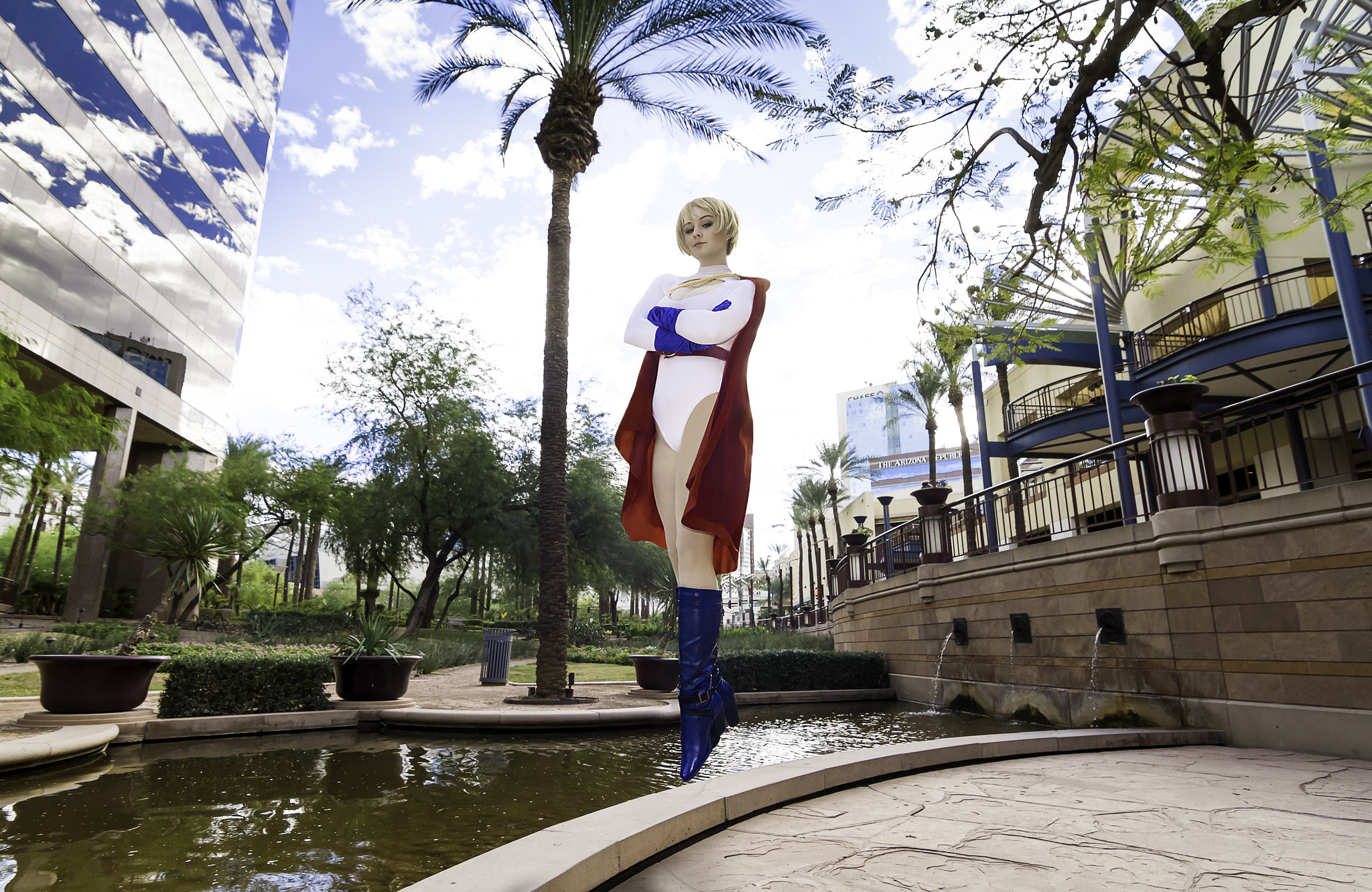
- I wanted to include this piece because it takes elements from not just photography but also 2d and 3d design, incorporating the "low-poly" style, which helps to tell more about me. It includes unity/variety, emphasis, and contrast.
- Non-traditional Digital Photography, 17.28 x 11.52in @ 300 dpi

- I included this image because it exemplifies many elements of design. It includes balance, emphasis, rhythm, and repetition.
- Digital Photography, 16.38 x 10.9 in @ 300ppi
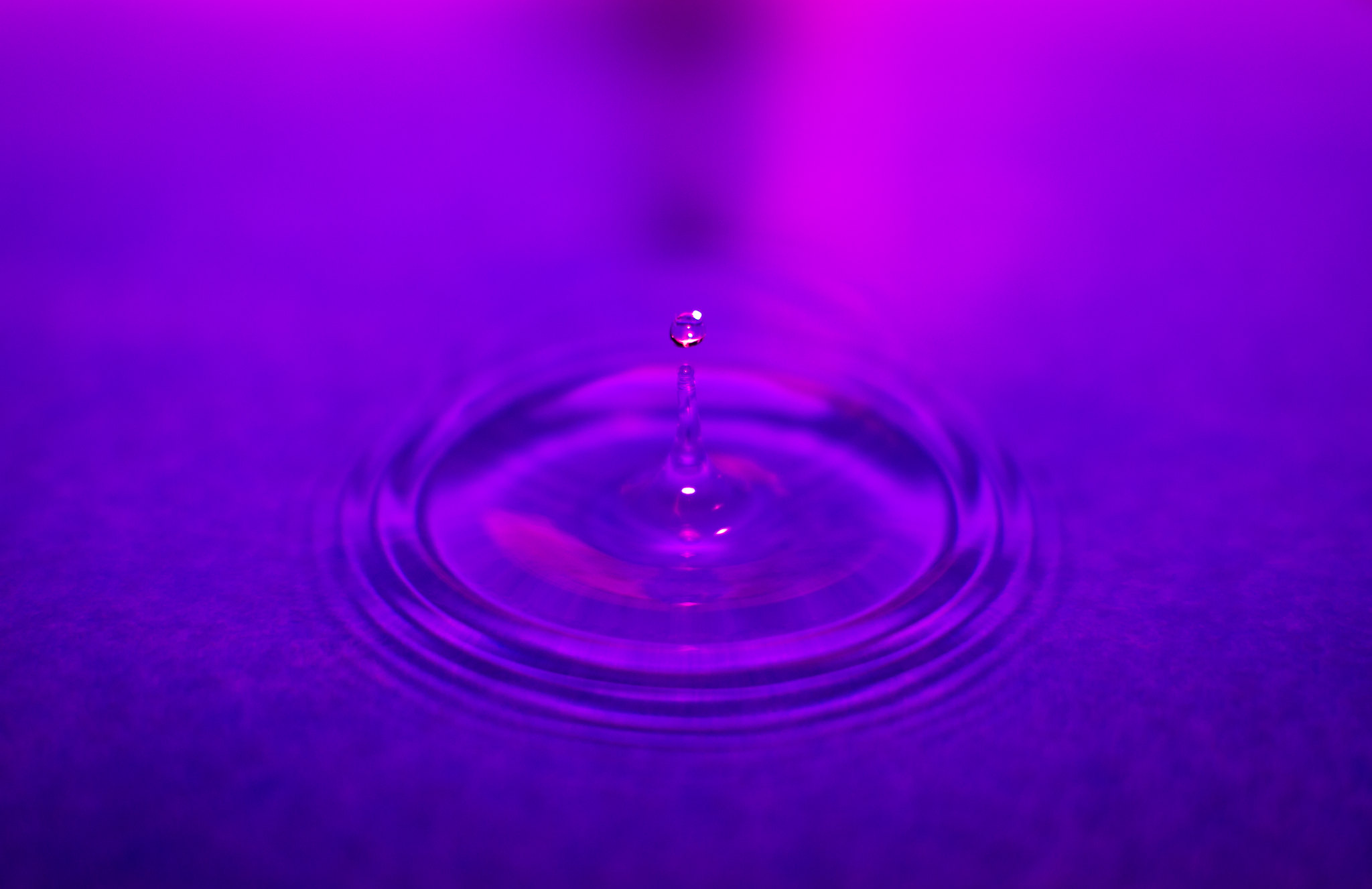
- I decided to include this image because I think that it is visually pleasing and it represents part of my surreal portraiture work. In addition, it includes several elements of design, including emphasis, contrast, figure/ground relationship, and proportion/scale.
- Digital Photography, 10.6 x 16.1in @ 300dpi
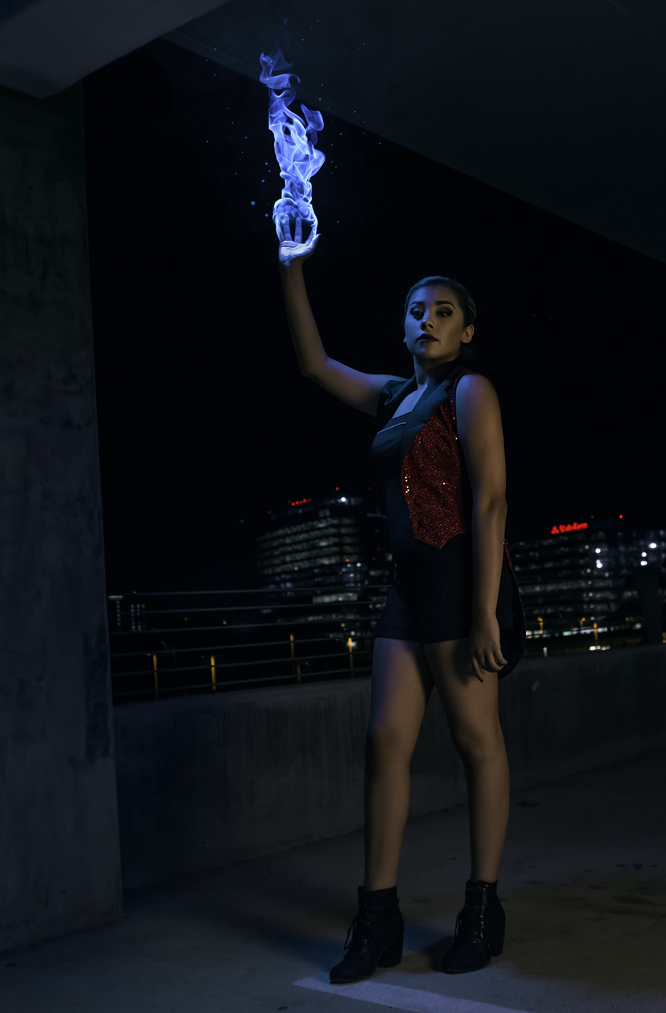
- I wanted to include this image because it shows a type of photograpy that I don't have a lot of in the rest of my portfolio, and I really like how it turned out. In addition, it includes several elements of design, including balance, emphasis, and proportion/scale.
- Digital Photography, 16.16in x 9.88in @ 300dpi
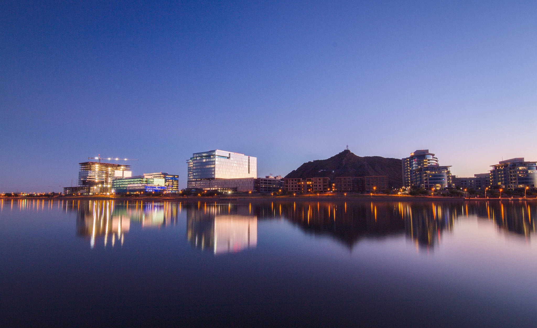
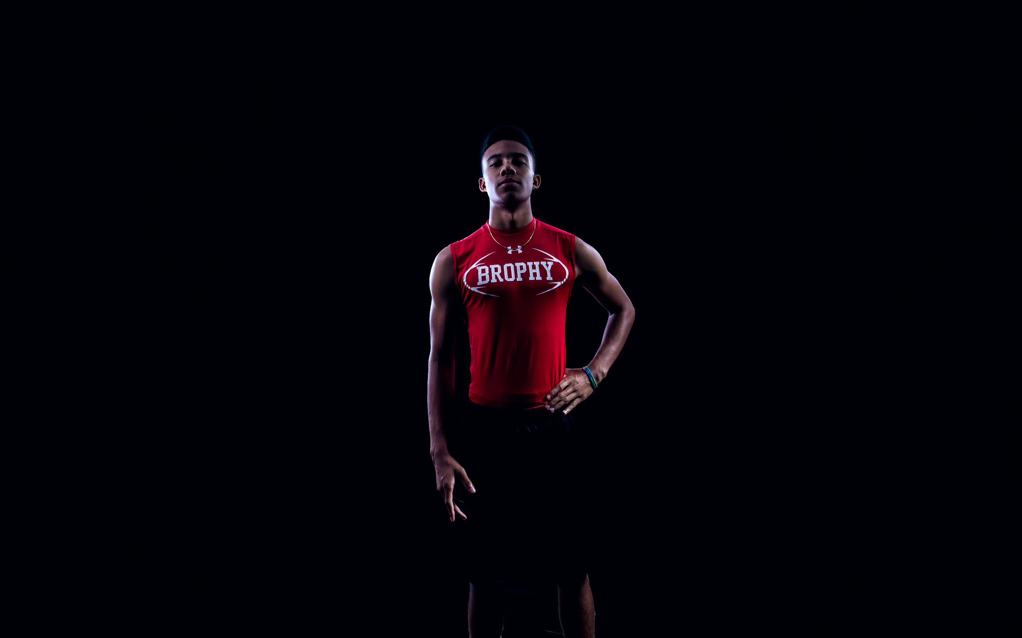
- I wanted to include this photo because I think it is a good example of a more traditional, or at least not surreal portrait. It also includes several elements of composition including balance, emphasis, and contrast.
- Digital Photography, 27.6 x 17.28 in @ 300dpi
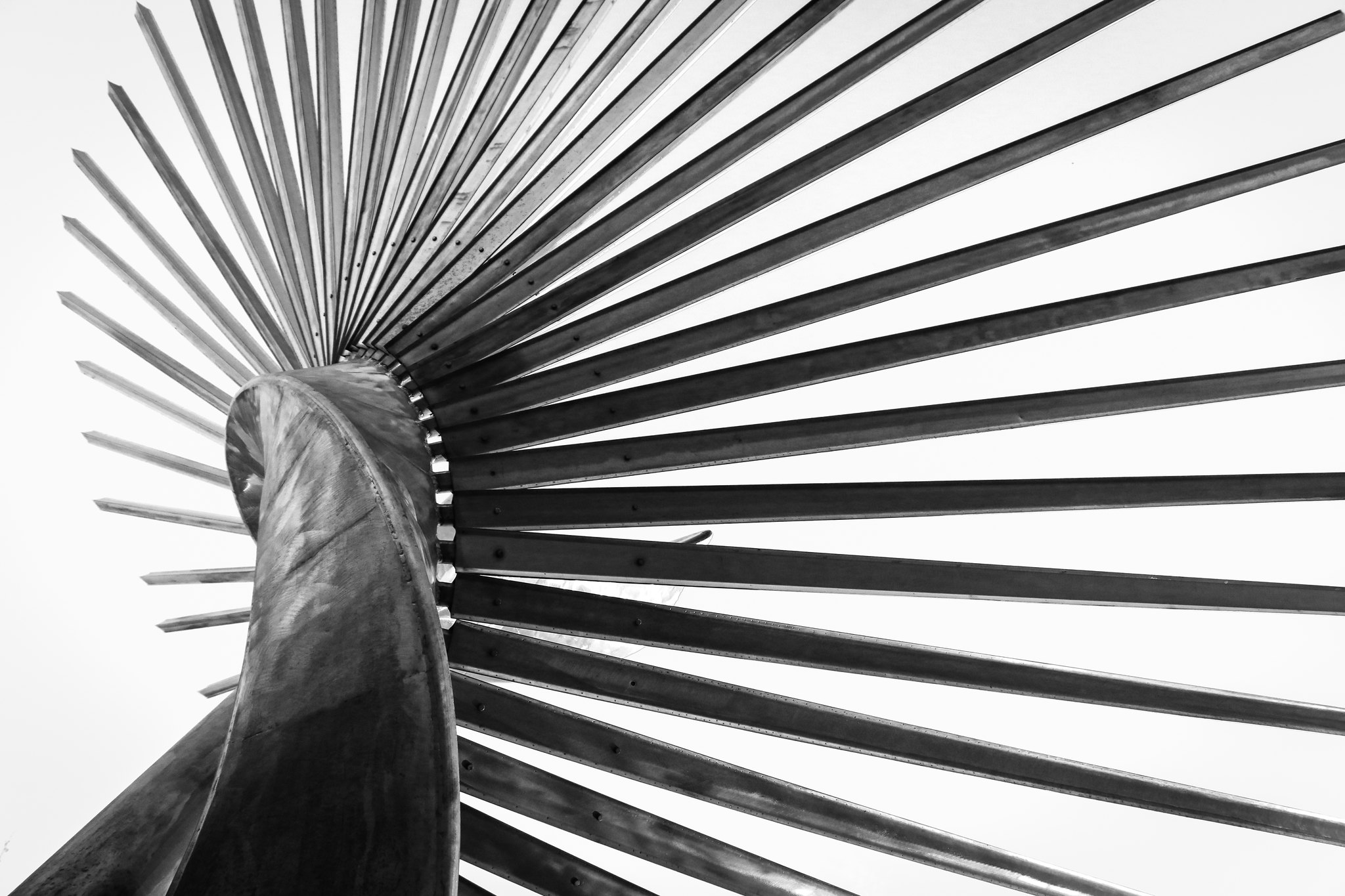
- I wanted to include this photo because it is one of my favorite "abstract" photos that I have taken and it includes several important elements of design including unity/variety, rhythm, and repetition.
- Digital Photography, 18.24 x 12.16in 300 dpi
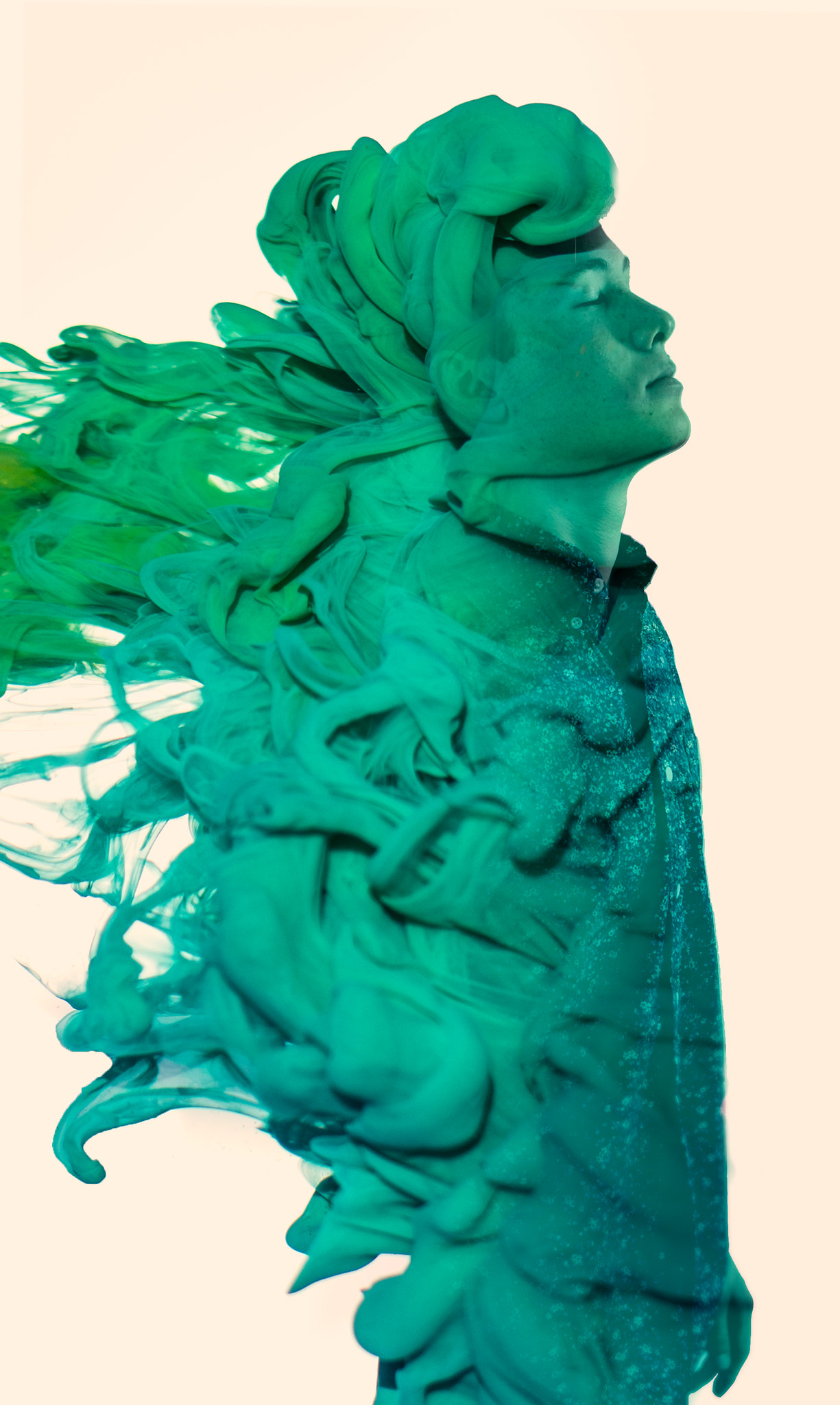
- I decided to include this image in my breadth porfolio as it is another surreal portrait that I believe is visually appealing, but hits on different elements than others. It includes unity/variety and contrast.
- Composite Digital Photography, 13.65 x 9.07in @ 300dpi

- I decided to include this photo because I think it is the best astrophoto I've taken and astrophotography is a fairly large part of the photography I do. It also includes multiple elements of design: balance and rhythm.
- Composite Digital Photography, 15 x 15 in @ 300 dpi

- I decided to include this image because I think it displays some of my design skills in addition to just photography and because I think it illustrates the concept of the image well. It includes balance and contrast.
- Digital Photography, 38.1 x 7.5 in @ 300dpi

- I wanted to include this image because it is one of my top two or three images that I have taken so far as it combines several different skills from camera/lighting skills to processing skills. It includes contrast and rhythm.
- Composite Digital Photography, 7.6 x 12.7 in @ 300dpi
Latest Posts
- (Nurturing) The Soul of a Computer EngineerA love letter to myself, to computers, and to the culture that surrounds them I was brought to tears while walking to work this morning.…read more →
- A Whirlwind Tour of Games Color ManagementA coworker recently asked me this question during a discussion about color management and encoding. I wrote the original version of this…read more →